Richard Skinner
Okay, this post is way late. As evidenced by the fact that I just changed the date for it in my document from “July ??” to “August 4.” Well, the same year, at least… I did have all of the notes done for it last month, but just could not work my way around to getting it done. (Actually, I have a whole bunch of notes, and the pictures, for an “appendix post” that I’ll be doing after this series is finished – “Covers, Through the Ages and Around the World.”)
In any case, this is the post where I rip my own covers (all two of them) up for your enjoyment and hopefully your edumacation. There are problems with just about all of the rules laid out by my “mentors” in their blog posts – please see Part One of this series for the links to them. The more “technical” issues involve the principles laid out by Cedar Sanderson in her Art of Design posts, though, so I’ve repeated the links to those two here, as you might want to have them open side-by-side with this one:
The Art of Design
The Art of Design, Part II
So, on to the covers, which you can see below. (Yes, those are clickable links to Amazon. No pressure here… At some time in the future, though, I’ll be writing about marketing, and how you never pass up a proper opportunity to do it.)
The first rule of cover design: Signal! Signal, signal, signal! Whatever categories your work ends up in on Amazon, even if they are exactly right (for getting them right, go read Dorothy Grant, aka “fynbospress”) – if your cover does not signal the same category, the browsing customer will not click on it. I can virtually guarantee that.
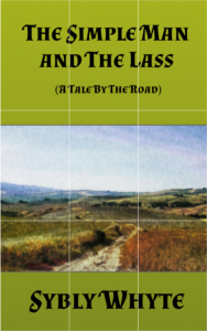
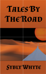
So, what are the signaling issues here on the Tales covers? Well, they are rather vague. Wishy-washy. Actually, the Simple Man and the Lass cover is the worse of the two for accomplishing the objective. But even Tales By The Road really doesn’t cut it, although it has The Road, a lifeless sandy desert, and a huge red sun. Yes, it feels “science fictional,” but not exclusively so – it could be something like one of the hugely depressing psychological pieces, with a title like “Road To Nowhere.” Okay, maybe I’m just being hard on myself, but that is what I see here.
The Simple Man and the Lass is worse, as I’ve already noted. It really gives no clue that it has anything to do with either science fiction or fantasy – it could be a travel guide, a back-to-nature piece, almost anything. Okay, it does fit with the “pastoral” keyword I hung on it, but that’s about it (and that keyword did very little for Amazon search engine hits, believe me – it’s drowned out entirely by religious-themed items).
Now, assuming you get an even halfway decent basic “look” for a series of stories or novels, you probably won’t hit the problems that I’m having here. Which is that the Tales are going to be all over the map so far as “genre” goes. Yes, they are all science fiction / fantasy; the common thread of a sentient road telepathically telling its stories to a far-future human makes them that. But they are also going to be very different from each other beyond that starting point. The Simple Man and the Lass is a “pastoral light romance.” The next one, Fugitive, is firmly set in the “historic military combat” slot. After that comes a “social problems” piece, a “horror” story, a “Christmas story” piece, even a “murder mystery / police procedural” bit. No, I really don’t know how I got myself into this mess, but I blame the Muse…
Second rule: Stand out! Now, this is not such an easy thing to accomplish, at least in the current “cycle” of cover design. For a while, some years back, you could manage it with a cover of screaming yellow, or fire engine red. Right up until everyone began doing the same thing. Yes, the human eye is attracted more to bright colors, but that is not enough. Because the human eye is far more attracted to the visually different thing – a genetic legacy from the days when seeing the “different” was pretty much associated with whether we were the eaters – or the eaten.
The only advice I can give you – and remember that this is from a newbie – is to open up Amazon and start searching with the keywords you have selected for your work. Plus those that you think Amazon will pick from your blurb. What?! The keywords and the blurb have to be done before the cover? Yep. See here, and here, and here (Sarah’s second point on that last). How will you know whether a prospective cover design will stand out unless you are comparing it to the environment in which its going to be seen? A tip here: add a search by length too. For the Tales, I add “short” and “novelette” to the terms – those pretty much drop me into the “one hour or less” categories. Many people are looking for a quick read on their commute or during lunch break, while others are trying to find something for a weekend read.
For my own research, I copy the cover images I find into a temporary Word document for easy reference. (Mostly right now because the “short” category is largely populated with page after page of the “reading guides,” which don’t have real covers.) Then I start comparing them with my rough sketch. Another tip: when I have put together the really rough cover, I sweet-talk the family into coming in and doing the same comparison. It is all too easy to fall in love with “your” baby and not realize that the poor thing really looks just like everyone else’s kid. (Mothers reading this – yes, I know you have always been able to tell your child from a thousand others. Nobody else in the world can, including Dad, which is why babies get their ID bracelet before they’re allowed even ten feet away from you.)
Okay, how do my two covers stack up? Well, so-so. The “banded” design does, but that choice was a sub-optimal one (although mostly necessary). Yes, when and if the Tales acquire a fan base, they will be easy to find, which is a plus. But the new reader is barely going to notice the style. Otherwise, Tales By The Road has a decent color contrast, with the reddish elements against the black sky; that helps. The Simple Man and the Lass though, does not have this advantage – and there are a lot of other “greenish” and “country” covers in the Amazonian wilds.
Third rule: Give the right first impression! This is related to signaling the genre, and the category – but at a lower level. The level where the reader is making the decision about whether to click on your cover for more information. Amazon does its best to slot your work into the right places for the search engine, but they will never quite get it right. Between newbies like me using the wrong keyword (see above for how “pastoral” worked out for me), and writers that are deliberately gaming the system to get their works visibility in places where they honestly do not belong (see Sarah Hoyt’s rant), a typical search is going to turn up a lot of results that have absolutely no similarity to your offering. This is when your cover needs to say “Yes, this really is something you are looking for. Click with confidence!”
On this count – well, let’s say I’m not happy at all. Tales By The Road does look like its genre. But what is conveyed to the reader (in my honest opinion) is something that is not in the story – a feeling like it is an “end of the line” piece. Everyone is gone, the world is dead, don’t read if you are feeling at all depressed… Now, there is a bit of that element in the story, but that is certainly not the central theme. (Short critique mode here – the story is slow, it does lack any action – but it is, I hope, not depressive in tone.)
For The Simple Man and the Lass, well, the less said the better… About all that this cover tells someone is that the story is set in the countryside. Which is accurate, but not particularly helpful to someone paging through their search results.
Fourth rule: Branding! You might think that this rule applies only to series, which it definitely does – but it also applies to your brand. You, the writer. If you are reading this post to learn something about creating your own covers, you are obviously the publishing company too. (And the marketing department, and the bookkeeper, and the secretary, and the bottle-washer-in-chief…)
Your covers should at least be similar enough to identify them as all being part of your “product line.” Whether they are stand-alone or part of a series. I use “product line” quite deliberately here, too – you may have, almost certainly will have several of them. Maybe under different pen names, like “Sybly Whyte,” or under one name, but in several different genres. Each of your lines can have a different look, and it is probably a good idea to make sure that they do. (Beyond the obvious differences due to the other rules.)
My two covers, and the ones that are in the works yet, do at least manage to convey the Tales By The Road brand – and also the “Sybly Whyte” brand. If Sybly ever writes something that is not a Tale, I may run into some difficulties, however.
Next up are two of the “technical” rules If you still haven’t read Cedar’s posts on these, please do so now.
Technical rule one: Align the elements of your cover design. Elements that are not aligned – either with their edges along a common line (vertical and/or horizontal), or through their centers, give the viewer a “cognitive break”; i.e., their understanding of the whole composition does not flow smoothly.
This is only the first alignment principle, though, and the easiest to understand. There are two more:
The second alignment principle is the rule of thirds. To me, this should really be called the “rule of ninths,” but I have to go with the label of the experts, here. The basic notion here is that you do not place the most important element (the one that you want the viewer’s eye attracted to first) in the center of the picture – either vertically or horizontally. For various psychological reasons, the eye is attracted more to something that is not at the “main focus” – it will naturally drift to an object that is either to the left or the right, or (less so) above or below the dead center of an image. (Note, here, an image. It is better to align your text along the center line, or the left edge; very rarely, the right edge.) Cedar explains this more fully in her post (Part II) – but for an even more detailed explanation, and even more technical one, see Poster Composition and Layout. There are a lot of similarities between poster design and book cover design. (Hat tip to Dorothy Grant, here.)
Quickly here, let’s chop the two covers into rule of thirds grids:
Do you see the problems here? Nothing in the pictures is really aligned along the “thirds” lines. In Tales By The Road, the road is way over on the right hand edge – and in the middle third of the cover, it is in competition with the Sun. It does not receive the emphasis that it should. Even worse is The Simple Man and the Lass, with the road in the horizontal center of the page. Meh.
One thing that is pretty close to right, though you have to read the poster composition article – the horizons on the images are where they should be. Yay! Also notice that the title is completely above the upper line in both cases, which is also a goodness thing. (The Simple Man and the Lass has a problem with the size and arrangement of the title and subtitle – but typography layout is for a later post.)
Now, the same covers, but divided into quarters – to make the “Gutenberg Diagram” for them. Sorry, this post is already incredibly late, so I didn’t add the arrows to it. Please see Cedar’s Part II post, but the basic idea is that people look at an image pretty much like they read (in the West, anyway) – from left to right on the top half, then from left to right on the bottom half. The top half quadrants are the “stronger” part of the image, meaning that they make or break that first impression, and “color” the impression of the bottom half. The right part of the bottom half is also more important – that’s where the “parting impression” is made, assuming the viewer does scan the entire cover.
|

|
Again, the titles are in the right places – but the primary parts of the images really aren’t. Now, everything obviously cannot go into the “Primary Optical Area” and the “Strong Fallow Area” (using the diagram terminology – the upper left and upper right quadrants in non-psych-researcher speak). But both roads should be in the “Terminal Area,” or the bottom right quadrant. Not just the one on Tales By The Road.
Technical rule two: “Propositional denseness.” Okay, fancy, fancy words. Lotsa syllables… What does this mean? Simply put, it is the principle of packing as much information about what is inside the book into the outside of it – i.e., the cover. Essentially, Rules One and Three from above. Now, that does not mean just the image, but that is a big part of it. It also includes any snippets of reviews that you use. For printed books, it includes the blurb and review snippets on the back of a paperback, or (if you are wildly successful and start publishing hard covers) on the flyleaves.
The Simple Man and the Lass is again a “meh” in this respect. The only “proposition” it gives is that the story takes place out in the boondocks, not the big city, not a small town, not the highway junction with a greasy spoon, a bar, and a gas station… Tales By The Road does much better – a lonely road in a lifeless desert on a planet about to die. Although the information that this is actually a road on the Earth would be clearer if it had the human figures in it that I wanted and foolishly thought that I could accomplish with my meagre skill set. Which leads into another rule (yes, the last one, for this post anyway). One that I realized all on my lonesome, although I am quite positive that somebody has covered it on Mad Genius Club, I just can’t find the post or posts.
The “Dynamic” Rule: Take a look at the top 100 sellers in your category (yes, everybody tells you that). Well, taking a look at my category (15-Minute Science Fiction & Fantasy Short Reads – where, yay! At the moment I write this I’m #146!). All right, throw out the “Reading Order” lists (if it weren’t for those…). Also the ones that absolutely should not be showing up here – uh, the first four books of A Game of Thrones? Now, I’m a fast reader, but… (This is me, manfully resisting the urge to comment on whether they are worth even fifteen minutes…)
Anyway, complaints about Amazon shelving aside – what do you see in just about all of the covers, or in science fiction / fantasy covers in general?
They have a live figure – a human or humans (or a recognizable approximation thereof), an alien, a dragon.
– or –
They have a spaceship, or a recognizably fantastic castle.
– or –
They have explosions. (Well, science fiction frequently does. But urban fantasy can have them too.)
– or –
They have humans, dragons, and exploding spaceships. (Yes, there are some…)
Tales By The Road covers have none of these elements. They are landscapes, with a road. Static. Sigh…
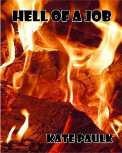
Okay, winding up. I cannot resist showing here one big exception to the humans / dragons / spaceships / explosions “rule.” While researching this post, I ran across Kate Paulk’s Hell of a Job short story. Which, if Amazon had its categories straight, would be in the top ten of my category. Take a look at her cover:
None of those “common” elements – but this is fantastically dynamic. Fits the story perfectly.
By the way – there are some covers in my tiny little corner of the Amazon biosphere that are far worse than mine. Not trying to make an excuse here, but I could have really had something to cry over.
Phew! Between research and writing, this post took me about five full days. Yuck. This makes it very clear that I am going to have to cut back some on my ambitions. So… Well, wait. I have an “anniversary and housekeeping post” that has been turning over in the back of my head all of this time, so I’ll put the details there. In fact, that one will probably go up before this one does, just by the amount of work I still have to do to actually get this one up on the blog. In the meantime, the homework readings are below. I will be back.
Links to things you should read:
The Art of Design
The Art of Design, Part II
Yes, you should have already read these. It never hurts to go back, there is a lot of information packed into these two.
Comprehensive Cover Art and Design
Cedar Sanderson here again – but more of “out of the trees and surveying the forest.” She covers the whole “gestalt” of a cover design here, at least for anyone looking to create (or critique) a science fiction or fantasy cover.
Poster Composition and Layout
The article on poster design. Again, there are many, many similarities to cover design – and this article goes into a great deal of depth on the technical, fiddly bits of layout. Including layouts that are not simple grids, and combine basic layouts to create some of the most iconic posters and covers that have ever been seen. Recommended for now, and when you graduate beyond “elementary” school (no, I’m not anywhere near that myself!)
Typography & Cover Art – It’s How You Say It
Dorothy Grant (“fynbospress”) on getting the typography of your cover right. Very important information here.
Going Indie For Dummies – But what is it ABOUT?
The whole gamut of what needs to be in your sales copy – written in Sarah Hoyt’s own inimitable style. The cover of your book is only the beginning, but it is, like everything else you put out there (besides the book itself) a piece of sales copy. Sarah goes over most of the other pieces in this post.
What’s It About? – How to write the stuff on the back of the book
Okay, you may have a “final” product for your ebook on Amazon (or elsewhere). But what about when you want to put out a print book? (Which you will, eventually, even if the majority of your sales are electrons – it’s really, really difficult to go to a con, or a book signing, or hold up your “Will write for food” sign on the corner, without a hard copy to hand to interested people.) Dorothy Grant goes over the “flip” side of a print book in this post on her blog.
The key to it all: Keywords
The other key: Keywords, Part II
Dorothy Grant again, this time writing for the Mad Genius Club. All about categories, and keywords, and getting them right on Amazon. Do not fail to read this! Unless you really want your fantastic, steamy, New Agey type novel “shelved” in the Young Adults – Philosophy section…

 A giant left our vale of tears yesterday. Yet — I still hear a booming voice, echoing from the mountainsides, ringing about the hills, reverberating through my head…
 Christmas Cookies, courtesy of Elaya Ice