Richard Skinner
This post was supposed to go up on Sunday. Then Monday. Then Tuesday. And here it is, Wednesday. With a post that is only the first part. When I refer in the future to the “Demon Post” – this is it. There were a few private issues involved, but the main reason for the delay and splitting up is that this is a larger topic, and I have more to say on it, than I originally envisioned.
Introduction
First off, a fair warning – this series of posts is about covers. The nitty-gritty of the creation thereof, not the designing of them. Design is very thoroughly covered (pardon) by several other bloggers out there – I’ve included some links at the end of the post to some of the best articles I have encountered so far. (Wednesday note – there are some links at the end. When I began digging into the blog posts that I knew were out there, I began following the links to other posts. And following. And following. There is more out there than I had any idea of. Okay, I thought, there are some compilations by other people out there of the various posts, I’ll just include links to those, too. Ack. Every link to a full compilation that I followed was dead. Bad words abused… So the plan now is to get my own compilation put together over the next few weeks and create a permanent resource page for them. Stay tuned…)
The series is also very specific to the sources (photographs and artwork from free or low cost stock sites) that I use. It’s not about creating artwork from scratch. You don’t want my advice on scratch artwork, believe me – I am not even in shouting range of being a visual artist.
They are also specific to the tools that I have used. So far, only the freeware GIMP – although Filter Forge is also installed on my system, on the recommendation of Sarah Hoyt and others – it is still in the limbo of my “to be learned” pile. So – while the basic operations are pretty much common across all serious graphic arts packages, the details are going to be different unless you also use GIMP. (Wednesday note – I will be getting into Filter Forge very soon now, like tomorrow. So there will be some coverage on using that tool. Delay is sometimes not completely bad…)
Another warning – I’ve admitted to not being a visual artist, but I am also a neophyte at creating covers. While I do believe I am managing to do a reasonably decent job, I am almost certainly not doing it in the easiest and most efficient way possible. At least right now. The purpose of this series, though, is not to make you a cover artist, it is to hopefully make you believe that you too can be a “reasonably decent” one. (I’ll be noting some of the mistakes that I have made so far as well – at the very least, you should learn some things to avoid doing.)
 So, all of that preliminary wool-gathering out of the way, let’s get started. First off is knowing what the final cover should look like. Duh. I’ll be using my first published piece, Tales By The Road, as the example for all of the following (well, it’s that or my second published piece – for which the cover is not quite done at this writing, although close to it, so there’s no link yet).
The Design
Having said this is not about cover design, I’m going to talk about cover design. No, I’m not a used car dealer in another life. But the starting point for any cover is having some kind of design in mind. (There are a few people that I think can sit down in front of their computer and just put things together on the fly – I’m not one of them, and I posit that most people visiting here aren’t either.)
What design? Well, read all of the links that I provide for what the design should be. It should be consistent with your genre, and subgenre, and your specific Amazon category (at this time – things change). It should be simple enough that it works as everything from your full size cover down to the Amazon thumbnail size. It has to have places that you can insert the front cover text – the title and your name – and have that be prominent.
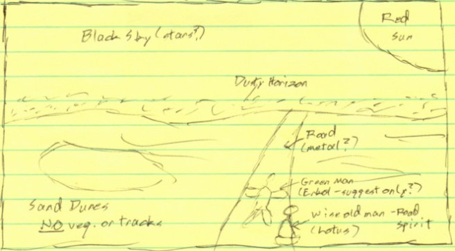
Even if your artistic ability is as horrible as mine, make a rough sketch of it, get it visualized on paper. Something can look good in your head, and you’ll see on the paper that it really doesn’t work when viewed from the other side of your eyeballs, or when compared to the “rules of cover design.” My sketch for Tales By The Road is below (pardon the lines, this was done on my notepad while I was taking a short break in the middle of the weekly shopping trip).
Then – take a while to think about your limitations. Not just your artistic ability, or knowledge of the tools, but also your budget – both money and time. Be as pessimistic as you can stand to make yourself, at least at first. Believe me, I was way too optimistic on all four of these considerations. I fortunately was able to learn better, although too slowly and painfully. Let’s run those down, maybe you won’t make the same mistakes…
Artistic ability. I am one of those people that says “Well, I know what I like, and that isn’t it.” Fortunately, I apparently do have a good eye – at least when I look at covers that the more experienced pronounce “good,” I agree with them, and also with most of the flaws that are pointed out. So far, so good. But that eye does not translate into creation. I did figure out early on that people are beyond my skill set. I just plain was not going to get those right. So the first things to go from my sketch were the “green man” and the “wise old man” – although after much wasted time in looking at stock photos.
Knowledge of the tools. My prior experience with the “visual arts” consisted of cleaning up screenshots of computer screens for documentation, and doing mockups of new designs. In Microsoft Paint. The only real “digital art” that I had ever done was for a CD sleeve on a software package many years ago, in Corel Draw. The less said about that effort, the better… (My boss told me that I should maybe think about applying for a job at a major laundry detergent company. Yes, that bad. He was actually being kind.) A digital arts package is a whole different ball game, and many of the tools are not at all intuitive for a newbie, even after slogging through tutorials. (Although don’t skip that part of the learning process. This is one place you really do RTFM – Read The Friggin’ Manual.)
Money budget. What the budget is in money really depends on what you are publishing. How much are you (honestly, now) expecting to make on the work that you are covering? How soon? For Tales By The Road, I knew quite well that the total wasn’t going to be anything fantastic, and as a first publication, it wouldn’t even hit its very modest stride before several more Tales hit the Kindle store. So, at 35 cents a sale, and somewhere between a nickel and a dime for a full read from the library – how long before I would make back even the extremely small cost of a stock photo? When I finally ran the numbers – a depressingly long time. So, for these Tales covers, I realized that I was limited to free photos and sweat equity. Again, after wasting far too much time looking at the cheapest photos possible on Dreamstime, I switched over to digging through Pixabay. Note that this depends on the work, and whether it is part of a series that you are planning. If the money is available, the first novel in my planned series is very likely to have a professional, paid-for cover. The long term payoff for having a first-rate cover there, and careful consistency between all of the covers, will make that expenditure more than worth it.
Time budget. Okay, I had some time pressure on Tales By The Road. Scratch “some,” substitute “heavy.” When I finally got serious on doing the cover for it myself, in early June, I had a “deadline” of getting the story published by the end of June. Which I almost managed. As I was entering the last week of June, though, I was getting a bit hysterical – the “painting” I had painfully put together was never going to cover the full height of the cover. Only something a bit less than half of it, actually, although (thank Ghu!) the width was okay. Considering my skill level, I was looking at another two weeks to a month of fiddling around with it if I was going to get it to cover from the top to the bottom. So I punted. I went to a “banded” cover design at nearly the last minute. Title up in the top band, then the “painting,” then the author name.
Now, this banded design is not an absolute “no-no” even today – take a look at the covers for David Weber’s very successful Safehold series – but it is not at all a common thing. In fact, all of the examples that I have handy are on books by established stars – where the bands let the publisher emphasize the author name above all else on the cover. In the case of the Safehold covers, it also let them put “ribbons” above and below the painting (and it is a real painting in his case) that contain sales copy. For Tales By The Road, these considerations don’t apply – it is “Sybly Who?” and no eloquent positive reviews. But I needed to get this beast out the door now. (Not spending more time was definitely the wise choice. Digging through my logs, I was actually shocked; I spent, in total, more than thirty-seven hours on this cover. Going by my average production rate for new words, I sacrificed more than 15K of text for this thing. No, this won’t happen again, probably, hopefully… I’ve managed to make a lot of mistakes. Yes, that is a good thing.
Okay, that is it for this post, and my tiny contribution to the art and realities of cover design. Time for you to head out to the blogosphere and read what the truly knowledgeable have to say. Do some exercises, too; dig through the best sellers in your corner of Amazon, see what those have for covers, think about them in light of the vast experience distilled into the posts that I’m linking to below.
Oh – if you are planning to get started on your own cover, yay for you! If you are, consider the four points I’ve covered today, and maybe make your own sketch. Class should convene again next Wednesday.
Useful Links – The Design
Going Indie for Dummies – 3 Signals and Sophistication
First up is this post by Sarah Hoyt on Mad Genius Club. The purpose of art in a gallery is to sell the art. No, I don’t know any artist that enjoys starving – and I do know several (unfortunately, no cover artists). The purpose of art on a book cover is to sell the words. This is a HUGE difference in orientation, and Sarah will at least get you oriented in the right direction with this post.
Ignorance, Expertise, and Asses
Okay, you’re getting advice here. You’re getting advice (and better) from the blog posts that I have linked to. Inevitably, you are going to get advice from somewhere that you really, really should not be getting it. Kate Paulk is famous for the impaling stakes she always has handy – and this post neatly skewers those who will give you (probably) well-meaning, but ultimately bad, advice. Consider reading this post a vaccination…
The Art of Design
The Art of Design, Part II
With these two posts, Cedar Sanderson digs into some of the technical aspects of visual design, which is a far vaster field than just book covers. She then applies those to the specific needs of designing covers. You might find some places in these two articles slow going – especially if you follow her links (recommended). But these two posts are something you should read and absorb before doing even a rough sketch of your cover. (Um, yes, I look back, and my absorption wasn’t perfect. Sigh. I’m re-reading these myself before I finish up the second cover this week…)
Sarah Hoyt again, on the real purpose of covers. This one, though, is focused more on how things change, constantly. The covers of yesteryear are all too often totally unsuitable for today, and today’s “killer” covers will be antiquated tomorrow. Now, I don’t think that Science Fiction is going to get away from “painted” covers all that soon – it is rather difficult to get a photograph of a believable alien, or a battle around a blazing blue giant star. Fantasy, though, could change back over to photographs any day, month, year now. Those being the two genres that I write (and read) in, I pay attention to trends in those. But Romance – now there is a genre that changes dizzyingly. Not to mention Erotic Romance – when I was a child, the standard cover for books of that type was plain brown wrapper…
Covers Gone Wild! (Non-Snoop Dogg Edition)
Speaking of Romances… Yep, I don’t read them, I don’t write them. But if you have some time, peruse this archive from the Smart Bitches, Trashy Books website.
WARNING, NOT SAFE FOR WORK! Read some of the “Cover Snark” posts. Yes, readers can be vicious about your cover – avoid becoming a victim! (If you are in the Romance genre, whether as a consumer or a producer – I think I can honestly recommend their whole site. Caveat emptor, though, considering my abysmal knowledge of the genre.)
Cover Her Face, Mine Eyes Dazzle*
This is how I wandered into the last website… Okay, Sarah again, talking about her experiences with bad covers over the years. A post that you should read, definitely – but I’m including this one more for the comments; dig down into those too. Like I say in my blog roll, the people that congregate around the Mad Geniuses are an extremely smart bunch of humans (with the occasionally encountered dragon, cat, ox, or time traveling alien for variety…).
*****
You may have noticed that most of these links, all but one in fact, go to the Mad Genius Club. Very good reasons for this – see the Blog Roll.

I think they would all seem “screwy” to me, Orvan. GIMP does have some help on its various tools – although they often seem to assume more knowledge about digital arts than I possess.
But to someone switching from something else to GIMP – or vice versa – oh yes. I had that just with having to switch from one “integrated programming environment” to another. IMHO, those are much, much simpler than graphic arts packages.
There are advantages to being a neophyte, at times. Although one does have to work to kill off bad habits before they get fully formed – I’ll have something about that in a later post.
LikeLike
A common complaint about GIMP is the interface not being what is expected. Even having no experience with any ‘image manipulator’ program, it can seem screwy, though supposedly it has gotten better with time. If one moves from, say, PhotoShop, to GIMP it will be very disorienting as they have a very different idea of the interface design. That said, it works the other way too. I used GIMP and once I had to do something using PhotoShop and it was very frustrating as – to me – everything was in the wrong place and mislabeled.
As with everything, the more one uses it, the easier it seems. Or: Practice helps.
LikeLike